Problem Statement
Optimize and redesign the navigation for NYU Langone's hospital and university site.
Role: UX Design Lead
Team: Creative Director, Associate Creative Director, UX Design Lead, Designer, and Moderator.
Overview
NYU Langone as an institution encompasses the medical school, research facilities, and hospital. The biggest challenge of this project was creating a seamless solution that would work across two different sites, each with their own local navigation, and six levels of content without changing the site architecture.
Site Purpose
nyulangone.org
Help patients and caregivers navigate NYU Langone Health’s various doctors and locations to understand their unique offerings, capabilities, and expertise in order to select the best fit for their needs.
med.nyu.edu
Provide a forum for recent research and educational content from the NYU School of Medicine to serve as an accessible resource for students, faculty, and staff while simultaneously acting as a recruitment tool for future talent.
Priority User Types
First we aligned with the client around all of the possible user types/personas who would use the two sites, and then we narrowed them down into primary and secondary users. Next, we combined the primary users for both .org and .edu and defined potential use cases by collaborating with the client. We used these user types and use cases to ensure that we were effectively addressing the primary users’s needs within the site.
Potential Patients
.Org
- Find a Doctor
- Learn about conditions and expertise
- Explore Locations
.Edu
- Learn about clinical trials and research efforts in an area of interest
Medical Professionals
.Org
- Find a Doctor to refer patients
- Research locations and services
- Learn about continuing medical education
Prospective Students
.Edu
- Understand and learn the value of NYU School of Medicine's training programs
- Find a program, division, or department of interest
- Learn about research programs
Prospective Faculty/Researchers
.Edu
- Explore collaboration opportunities
- Learn about departments and program
- Explore employment opportunities
- Learn about continuing medical education
Discovery
Our research began by searching within hospitals, educational institutions, health organizations, and other industries to determine best practices for navigation. We looked at 20 sites for inspiration and learnings and curated them based on our project’s unique needs. Ultimately, we found best in class examples that addressed nomenclature, identity, UX, visual design, and way-finding. I've include some illustrative examples below.
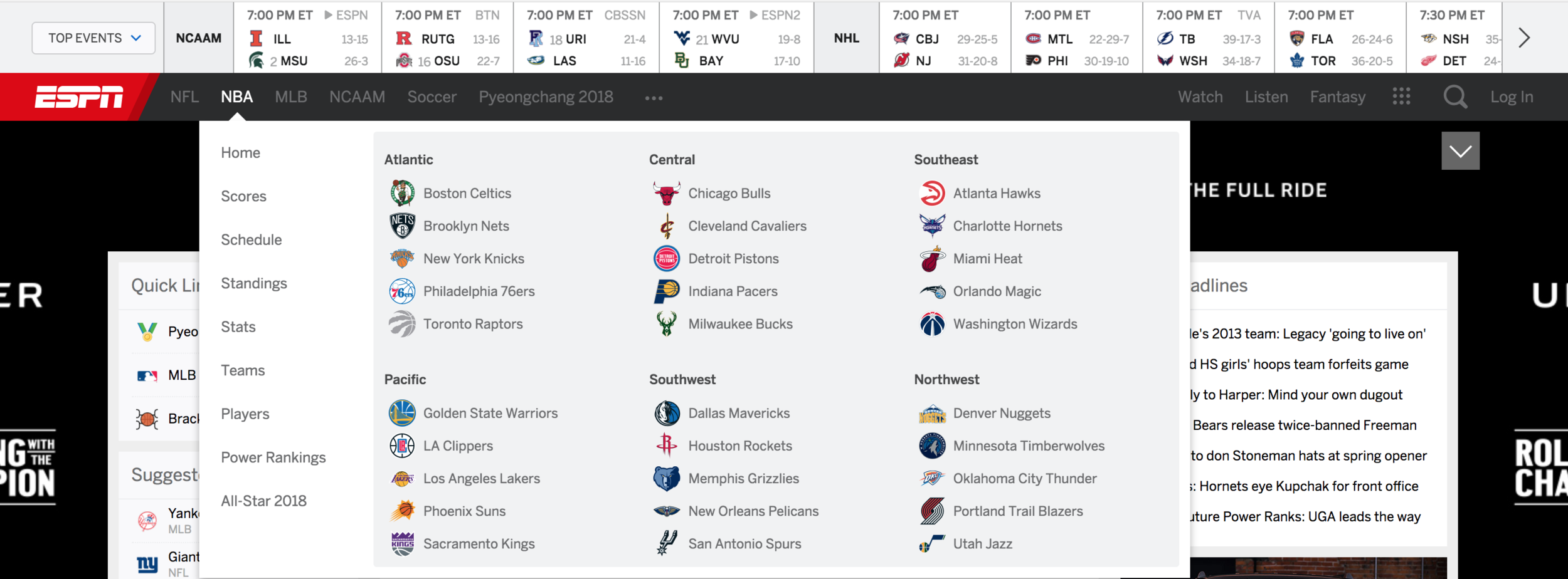
Way Finding: ESPN provides a clear indication of the active navigation states via UI elements, moments of branding (NBA), and color. All of the action takes place in one area, the upper left.
UX: On Gap’s website, the navigation elements are sticky and consistent throughout the experience. The user can quickly toggle between brands through the tab, and provides a connection from the global elements to the local.

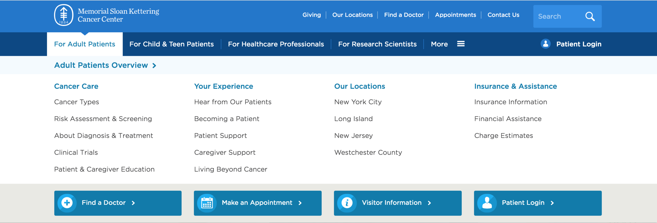
Visual Design: Memorial Sloan Kettering Cancer Center uses color across different verticals. It has prominent and clear calls to action featuring icons at the bottom of the page, which draw the eye to key actions.
Identity: Columbia uses single logo treatment and common global elements. The tab design for their “Mega-Toggle” feels connected to the individual brand It creates distinct identities for its main properties through visual design while maintaining a cohesive look and feel.

Site Audit and Ecosystem
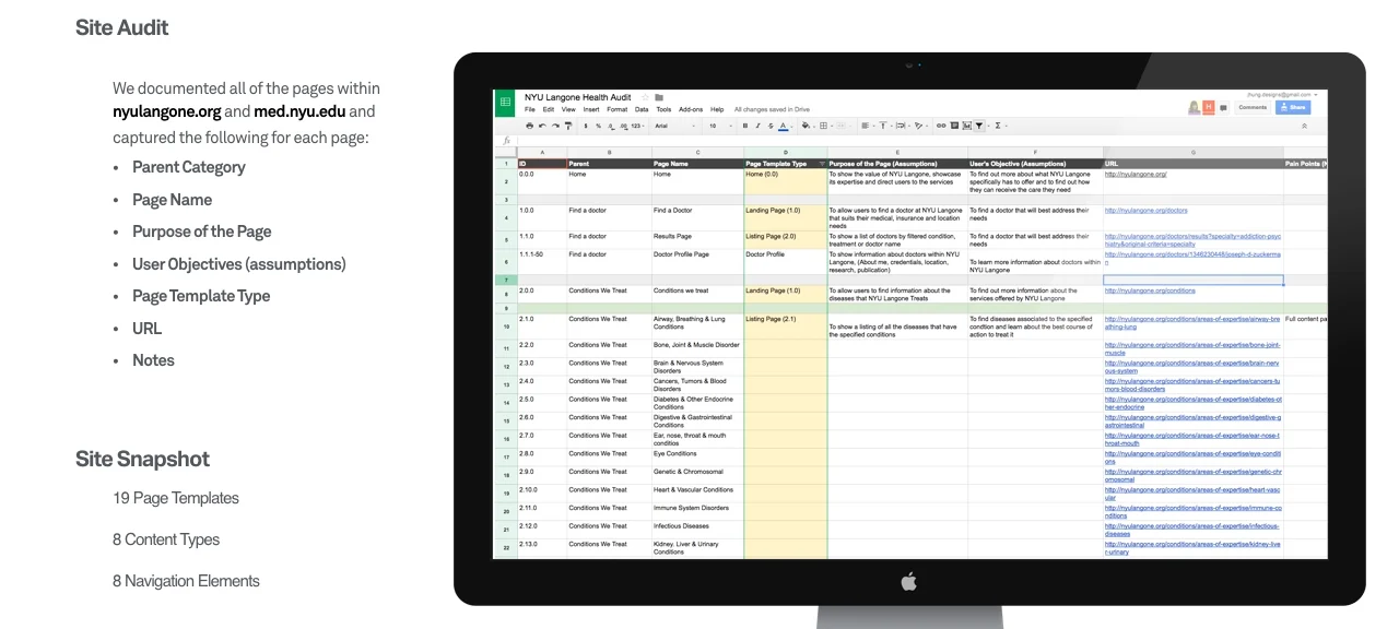
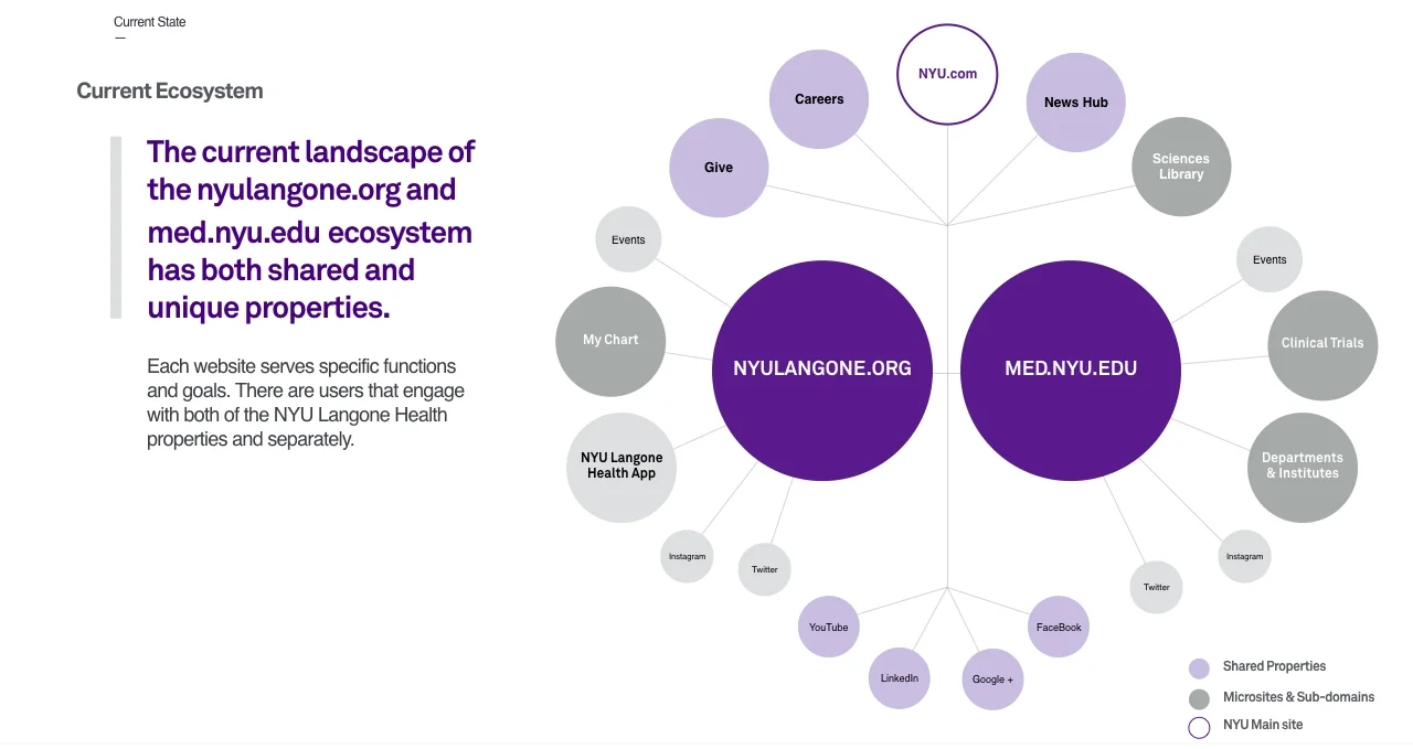
We then documented NYU Langone’s existing site architecture and reviewed the greater ecosystem to understand how best to help the user quickly and easily access the right information.
Designs Iterations
After getting sign off on personas, use cases, preferred best in class examples, site architecture, and the current ecosystem, we began wireframing and designing. We went through four rounds of design exploring the global, local, mega menu, page level, and footer behavior. Below are examples of different iterations per section and some of the thinking that went into each part.
Global Navigation
The global navigation posed the biggest challenge, and we decided to tackle it first as it would dictate how the rest of the navigation would work. Based on the examples we found in the discovery phase, we were able to quickly iterate and come up with a variety of solutions. We grouped and prioritized solutions that best fit the business and user needs, and presented them to the client. After discussion and feedback from the client, we paired down the number of ideas again, and the final contenders were a tabbed, toggle and overlay approach.
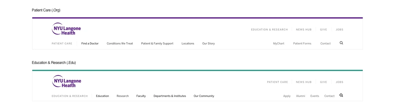
Tabbed
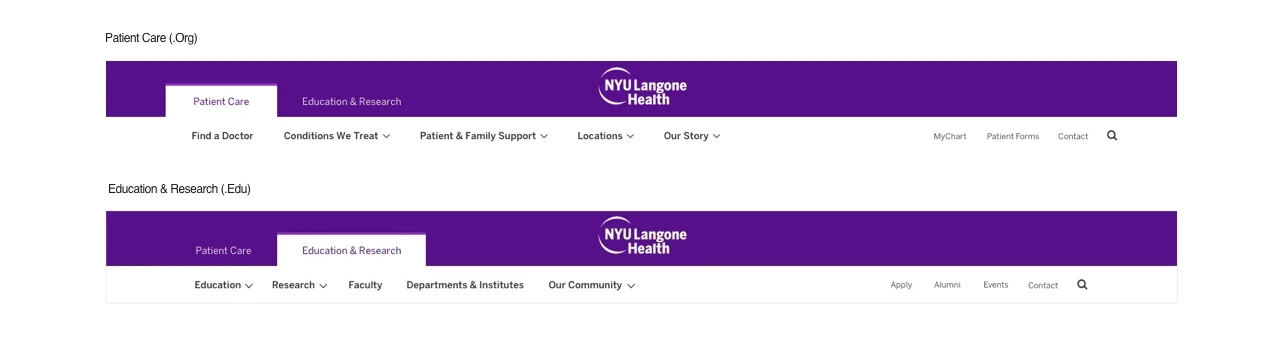
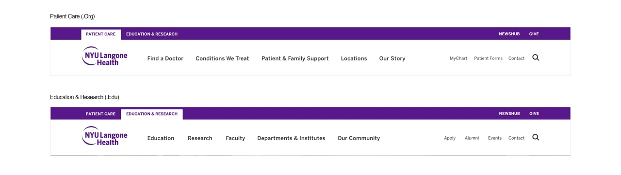
The tabbed approach teaches the user that there are two main services offered by NYU Langone Health and that they are currently within one part of that site. It makes the ecosystem feel cohesive without presenting irrelevant information to the user.
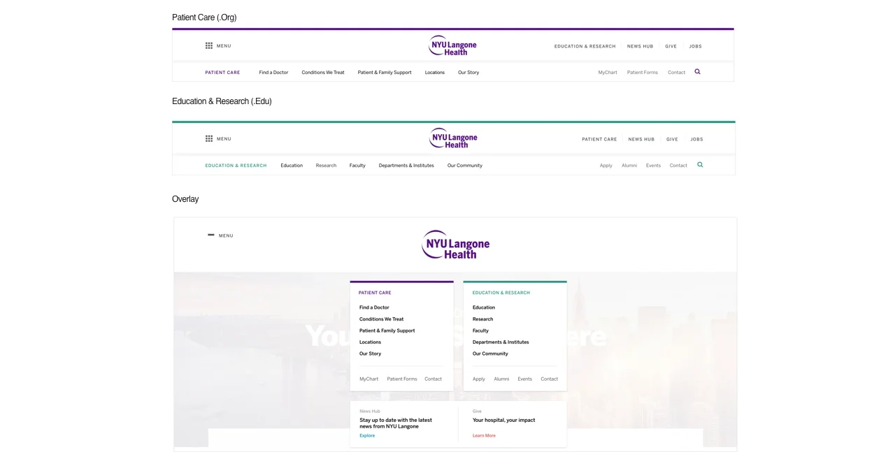
Toggle
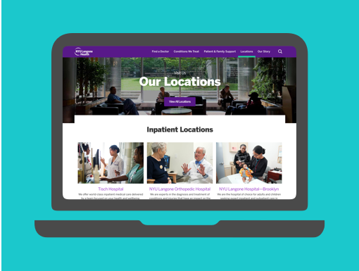
The toggle approach treats other sites affiliated with NYU Langone Health as separate entities but keeps them easily accessible to the user.
Overlay
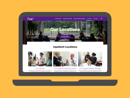
The overlay approach is one step further than the toggle. When the user clicks the menu button, they see local navigation items for both 'Patient Care' and 'Education & Research'. This gives the user more context as to what the rest of the site has to offer without navigating completely away from the current experience.
Final Design
After much debate with our team and the client we decided to test the tabbed and toggle approach. It seemed the most effective and least disruptive way to communicate the 'Patient Care' and 'Education & Research' offerings.
Mega Menu
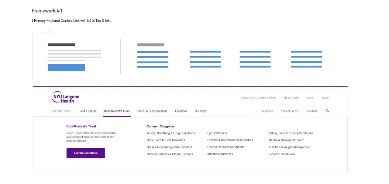
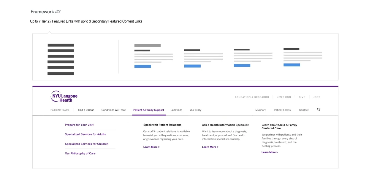
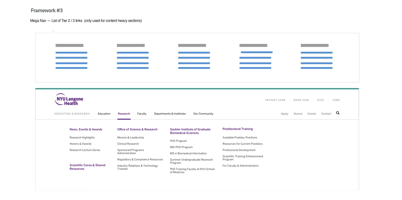
Contextual Mega Menu System
Due to the varying content both across and within the .Edu and .Org sites, a singular design system across all mega-menus doesn’t allow enough flexibility to provide an improved user experience. We decided to design a component-based design system that is contextual and flexible to the needs of each site and section using four components.

Page Level Navigation
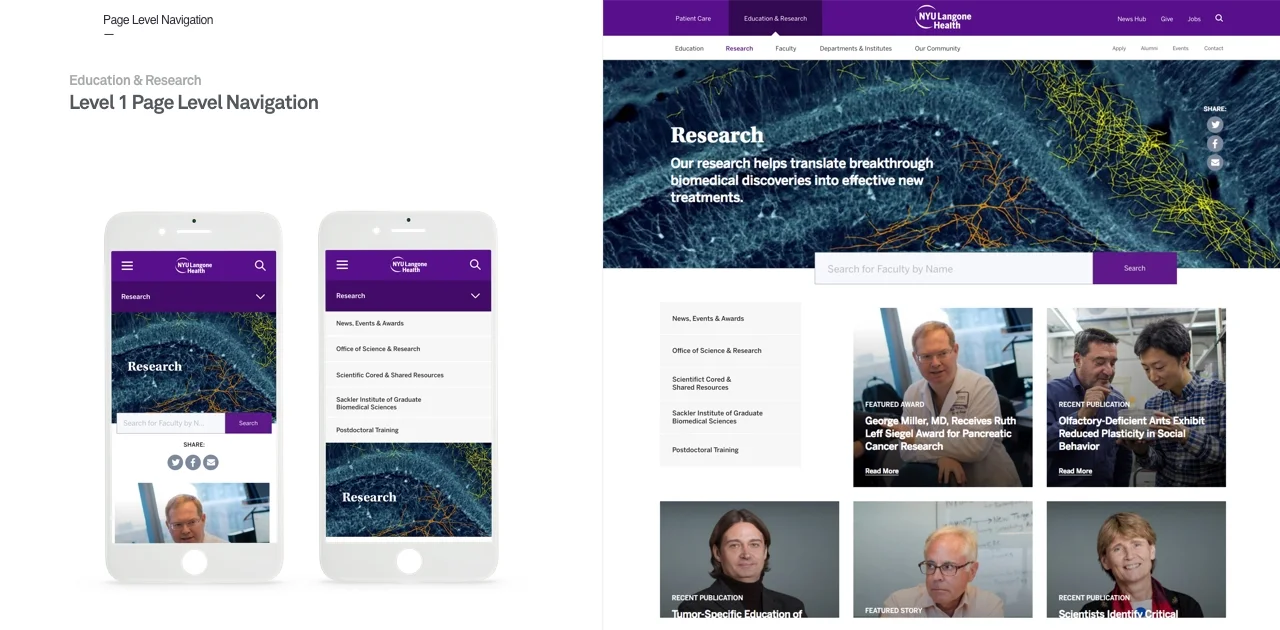
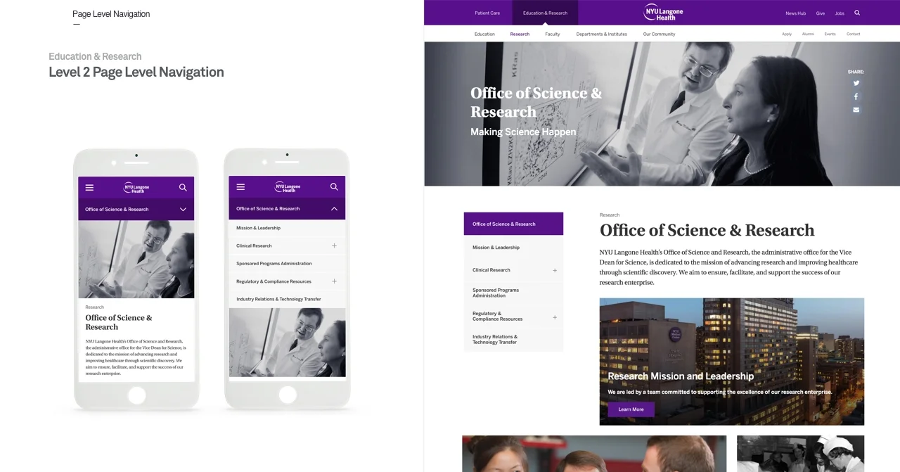
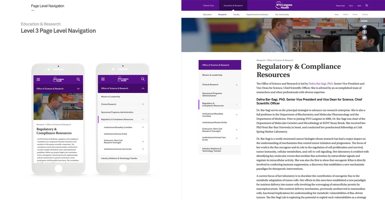
Content on the site was shallow in some parts and up to six levels deep in others. We made sure that all levels were accounted for and had a consistent structure
User Testing
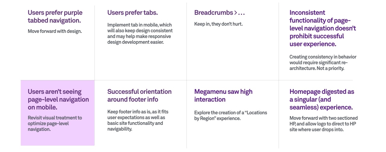
We picked two overall directions (the tabbed navigation and the toggle navigation), mobile and desktop, to test and recruited twelve respondents. Five were prospective patients, two referring doctors and/or nurses, two researchers/faculty members, and three students. They were half men and half women, ages 19-58, and from a mix of metropolitan areas. Each session was an hour long. The user was tasked with finding specific pages that was relevant to their background and then were asked questions about their experience and what was their primary use for the NYU site.
Conclusion
After discovery, four rounds of design, and user testing we handed off a final iteration that fit within the existing site architecture but was more effective in helping the user navigate to the right information. The final main tabbed approach is below. These updates will launch on their site September 2018 here: https://nyulangone.org/.